Heuristic Evaluation
2023Improving Accessibility on ZARA’s Web platform via Heuristic Evaluation
“In spring of 2023, we conducted a usability test on Zara’s Web Platform, aiming to identify the accessibility pain points experienced by the target audience and propose insightful recommendations for enhancements.”
When coronavirus affected the offline shopping experience worldwide, people couldn’t resist the urge to shop online and that’s when the reality hit hard. With approximately 1200 offline outlets being shut down, Zara faced a 44% sales slump in their business making it a major cause of concern.
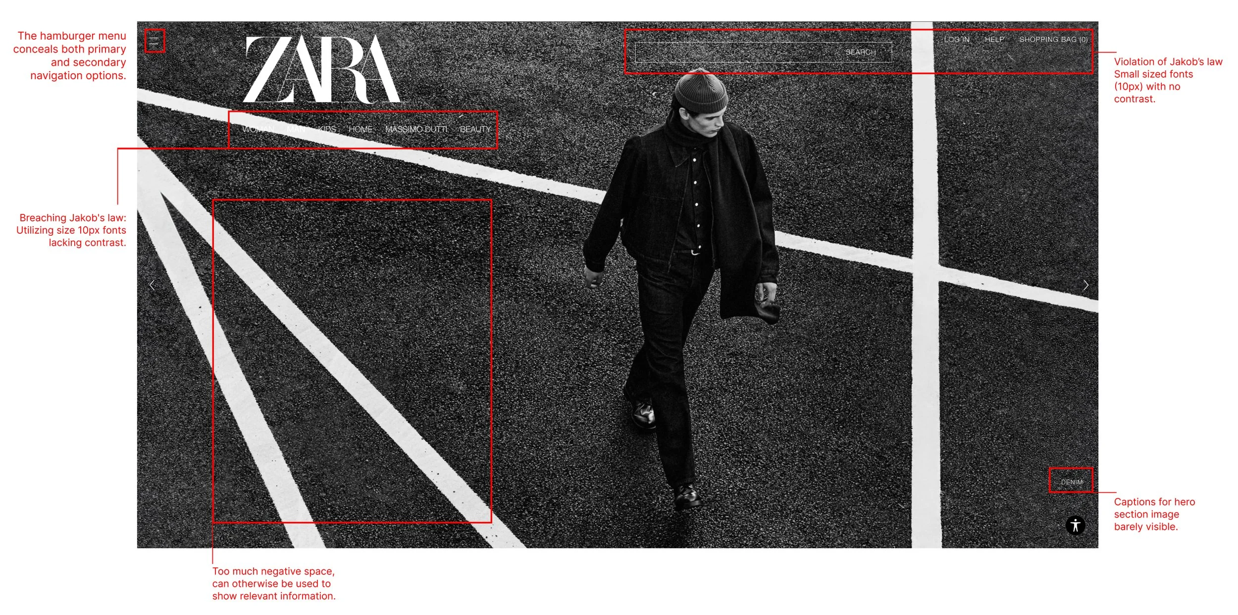
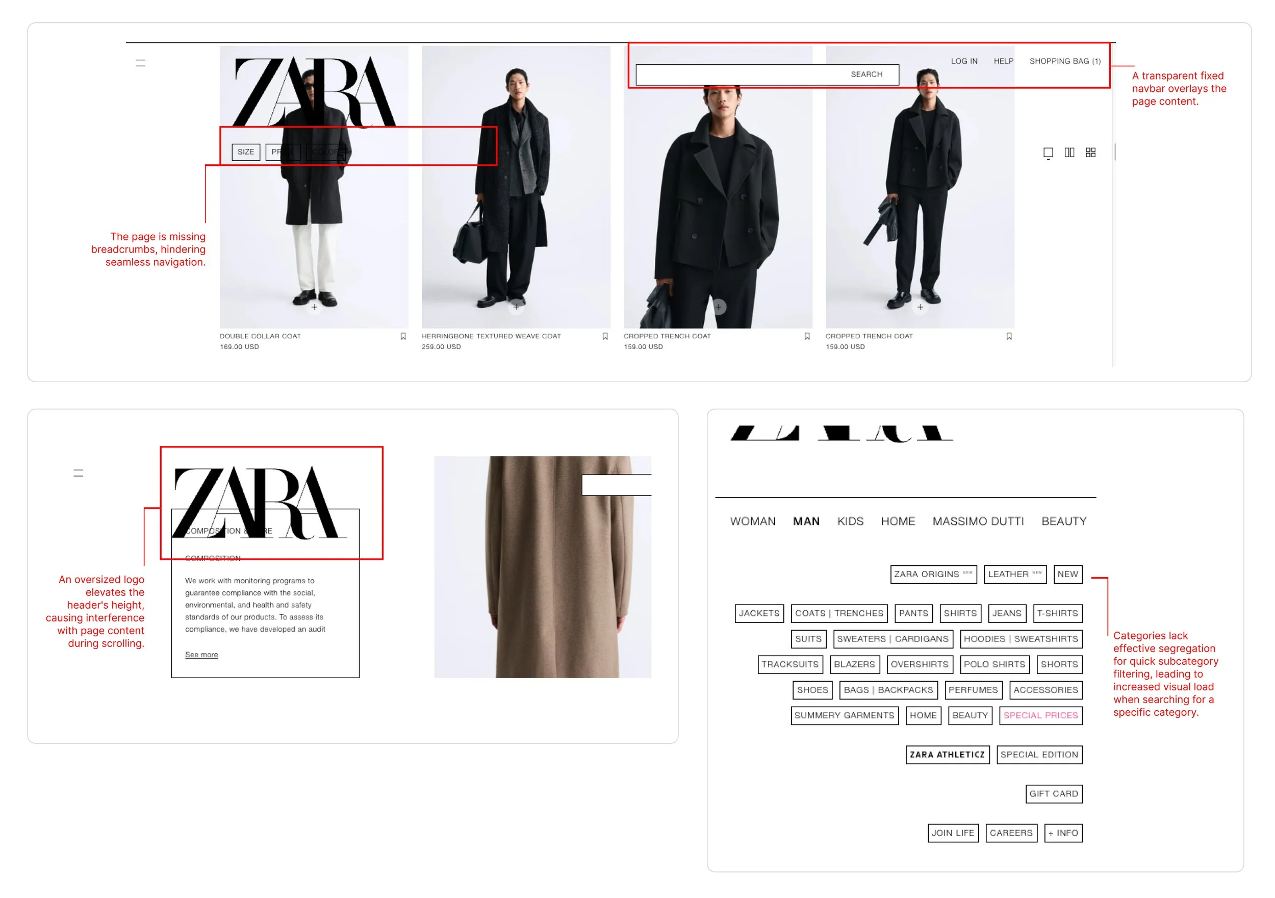
Here are some screenshots of the web portal as of Jan 2023.
Visually appealing pictures occupyingthe majority estate might not always be the right approach to open up to customers.
Specially when you want the customer to explore your product, they shouldn’t be searching for certain areas — the search bar, navigation links, and categories. Those should be visible within 5 seconds.
Users felt Confused
I asked open-ended questions to the selected research participants like:
How often do you order from ZARA?
Can you describe the experience of ordering?
Did you spend more than expected time in ordering online?
Are there any significant roadblocks your way?
Observed some participants for a few usability tests to understand the product buying user journey
Flow: Unguided
Participants: 5
Users felt Frustrated.
We dived deep into customer reviews and user emotions towards the online presence to find that Zara has a rating of 2.08 stars from 1,132 reviews, indicating that most customers are generally dissatisfied with their online platform experience.
Zara ranked 43th among Best Global Brands in the year 2023. It was ranked 25th in 2018 and has kept dropping ever since.
Post user interviews and usability testing, we had a good amount of understanding about the problem statement. So we started working on fixing the issues via design and preparing a case study. The tool used for the prototype was Moqups.
Onboarding starts with Information Clarity.
A feature we would like to add in the existing platform.
In our UX Revamp, the website has a better onboarding process in place. Post-development release, every time a new set of features are added in the platform which can be beneficial to the users will now be shown to the returning customers in the form of models.
Updated layout features ample white space and evenly distributed information essential for guiding users through their intended actions. Notable improvements comprise:
Integration of breadcrumbs to for status visibility.
Upfront primary navigation, complemented by clearly segregated secondary navigation.
Strategic utilization of imagery, limited to a designated section on the page, not exceeding 50% of the overall real estate.
Enhanced typography, adhering to industry-standard sizes for better accessibility.
Refined cart functionality and customer support sections for a more user-friendly experience.
Revamped product pages for an improved browsing and purchasing journey
The same Usability Task results showed user confidence boost by 60% on an average.
We carried out moderated usability testing, focusing on task-based evaluation and comparison to original version, to validate the prototype's usability and functionality.
Participants were tasked with comparing the navigation and overall layout of Zara's website to our prototype. Subsequently, they were assigned specific tasks, such as locating an item and placing an order, allowing us to assess the user experience comprehensively.
Learning
Enhancing an interface doesn't always necessitate an extensive budget or a complete overhaul. Sometimes, minor adjustments can wield a substantial impact. This project served as a reminder that even prominent brands with successful products and services can undergo significant improvement without incurring exorbitant costs.


