Interaction Design
2023, Boston
Thirfty Table
An app converting closing hours into business hours.
In a team of five members, I participated in primary research, conducting interviews with local shop owners, collecting data from card sorting, and taking the lead in designing the prototype.
fig2. The application had discounted listings from Fast-food businesses around a specific geolocation during their closing hours
Background
The United States has a significant problem with food waste, with an estimated 30-40% of the food supply going to waste each year.
Problem Space
Millions of Americans struggle with hunger and food insecurity, which can have serious negative health consequences
Problem Statement
How might we create a more efficient and equitable system for distributing excess food, with the goal of reducing waste and hunger in the United States.
Reduce food waste
The United States has a significant problem with food waste, with an estimated 30-40% of the food supply going to waste each year.
Partner with Chains
Strengthen partnerships with local food banks and other organizations to improve the effectiveness and impact of the platform
Overview
Thrift Table is an app that connects food donors with food recipients in the United States. A platform for people and restaurants to donate excess food to those in need, thereby reducing food waste and eventually helping to alleviate hunger.
We hypothesized that on average, the closing hours of local fast food businesses were not that profitable, and there was a lot of wastage of leftover food which could be otherwise used wisely.
fig2. Visual representation of how the closing hours could be converted into Business Hours
Developer Friendly
Blueprints
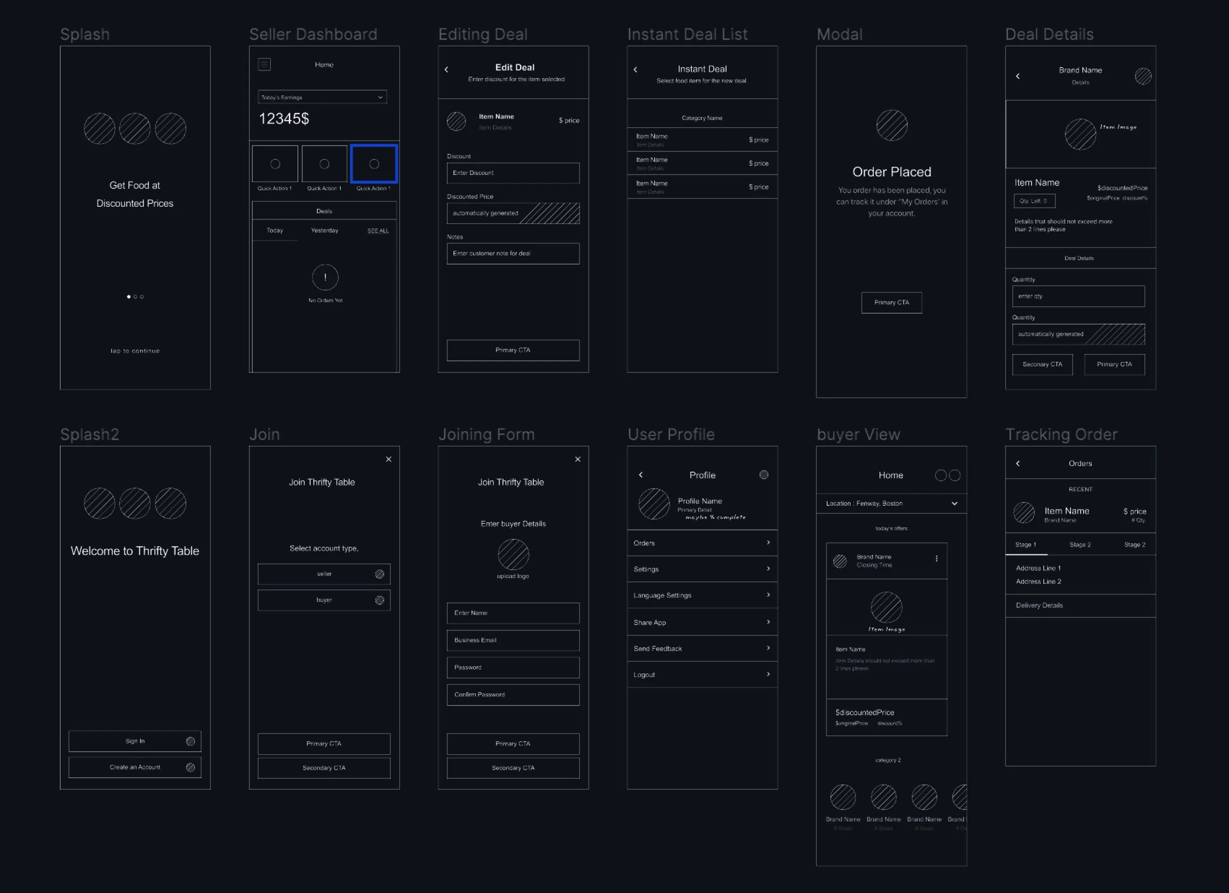
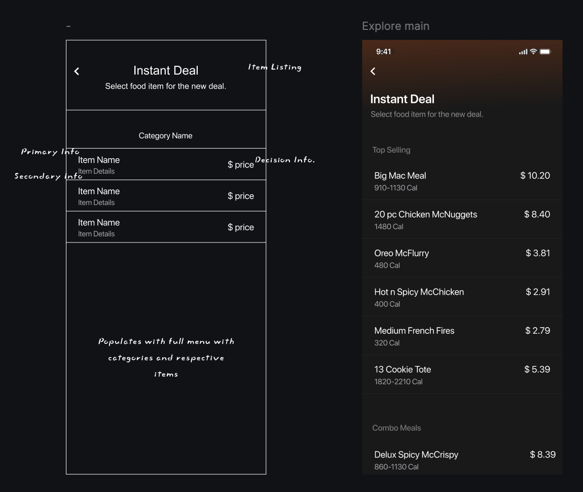
For the application blueprint, I scanned Apple’s Human Interface Guidelines & Google Material Design to maintain realistic industry standards that could undergo a development cycle with ease.
The application intends to solve a purpose, so the screens should aid that purpose and not divert the user’s attention with unnecessary clutter.
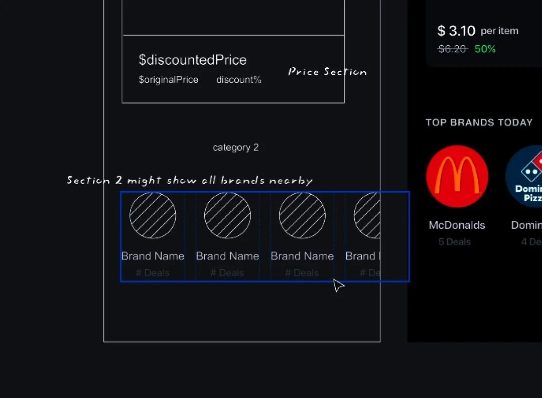
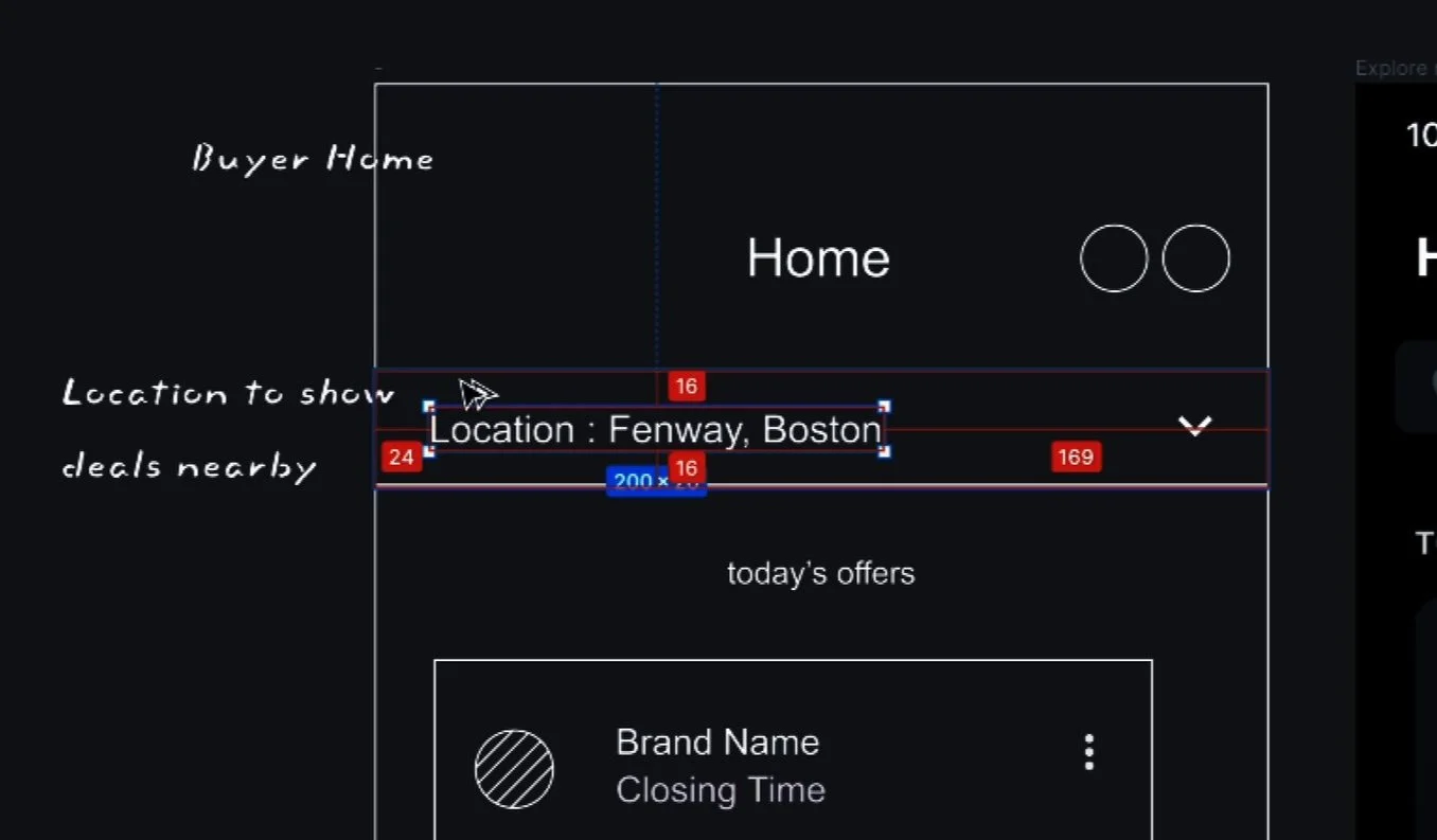
Detailed wireframes on the common figma board to make sure everyone on the team understood what was what, and everyone designed accordingly.
Mentioning components, variants, constraints, and 8px grid. (Google Material Design)
Rational thinking behind the Design
A lot of brainstorming sessions, virtual and in-person meetings, analysis of data, and refining of pixels went into the solutionting part.
We started with researching the target audience, hypothesizing problems, understanding user pain points via meetings, drawing flowcharts, journey mapping, and, eventually usability testing the prototype out with a few participants to finally conclude on the solution shown above.


